Statistics was believed after the master of the last century to be the science of correlation, not of causation. However it is clear to our contemporary researchers, at least some of them, that interpreting data without any guess about causation can bring to wrong conclusion. Here below, please find an example from: "The book of why: the new science of cause and effect" by Judea Pearl and Dana MacKenzie.
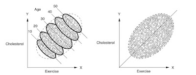
You should first look at the right figure. The scatterplot presents a roughly linear relation between Exercise and Cholesterol in blood. First observation, set this way, we probably have to reverse the axes. In a causal interpretation, it appears that exercise cannot cause cholesterol. On the contrary the cholesterol presence impose to the subjects to exercise more. Or there is something strange in data. More exercise cannot cause, by our normal belief, more cholesterol.
However, this is not actually even the main point. What the right figure suggests is that there is a positive correlation between the two variables: more cholesterol implies more exercise. However, as the left figure reveals, the real situation is not quite true. Because a cause of cholesterol is age, it appears that is reasonable to consider also this variable in the analysis. Then, when we separate the data among ages sets, we can see a further structure in the data and, in each class of age, in fact, the correlation between exercise and cholesterol is reversed. The less you exercise, the higher is your cholesterol. At the same time, the younger you are the less cholesterol you are expected to have in your blood. Now the picture is coherent with our causal expectations. I think there is something to learn. For more technical reader, one can give a look to: Casual Inference in Statistics.

Simpson's paradox! Some other great examples are here: https://en.wikipedia.org/wiki/Simpson's_paradox
ReplyDelete